• If you would like to get your account Verified, read this thread
  • The TMF is sponsored by Clips4sale - By supporting them, you're supporting us.
  • >>> If you cannot get into your account email me at [email protected] <<<
    Don't forget to include your username

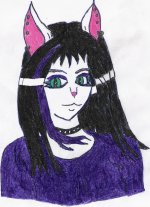
Luna's pic

darkwolf1

TMF Expert
Joined
Jul 21, 2005
Messages
506
Points
0
ok, for those of you who don't know who luna is.............SHAME ON YOU!!!!!

luna is the catgirl/kittyfied version of our own lovable ticklish goth, sammi-chan

well, she's been a good friend to me for a while now, and since i've been working on improving my artwork, i thought i'd post a bit on here.

So here is Luna's pic drawn by me...and she's owned by sammi-chan.
 

Attachments

  • luna colored2.JPG
    luna colored2.JPG
    329.1 KB · Views: 15
I emailed it to her to get her approval before i posted it. and she said she did. She also gave me a few tips to help make it look better.
 
ok, for those of you who don't know who luna is.............SHAME ON YOU!!!!!

SHAME ON ME!? MMMMMMMEEEEEEE?!

darkwolf said:
luna is the catgirl/kittyfied version of our own lovable ticklish goth, sammi-chan

So here is Luna's pic drawn by me...and she's owned by sammi-chan.

The face itself is pretty decent, but the color job could use some improvements, not so much in the colors, but in the tools you used and/or the way you used them. From what I can tell, this picture looks slightly glossy and it's speckled, which leads me to believe that you colored these with crayons as opposed to colored pencils (please correct me if I'm wrong). While theres no problem at all in choosing crayons or using them, it would definitely be a step up for you to switch to at least colored pencils. That way, you won't get that glossy look that makes the picture look pasty and you'll get better quality and color, even after it's scanned in.

Other than that, some more attention and detail in the clothing and accessories wouldn't hurt, since they're supposed to be expressing, to some degree, the personality or themes the person that is wearing them follows. If you give more attention to these things and focus on even little nuances, you'll produce better pictures that will catch more eyes. People will be like 'I like that you did this [insert what you did that they liked particularly]' and perhaps go on to tell you other things about the picture, thus leaving you with better feedback.
 
Last edited:
thanks for the advice Vlad, i atually was using colored pencils, but they aren't the greatest quality....unfortunately they are also new, so this si the first pic i've used them on to realize that the quality of said coloring device was indeed lacking. as for the details, if you mean the lip-ring, Sammi's actually been leaving it out of ehr last few pics, though thats more because they ahve been a classic cartoony nature, so the lipring would have distracted from the style.

i'm working on finding a color medium that works well for me, i';ve tried ms paint, photoshop, colored pencils, and even just b&w shading with a mechanical pencil. yet i can't seem to get anythign to work really well.

i'm debating trying prisma color markers, i hear they are very good, but i also know that the only shop in my county that sells them, wants almost 30 bucks for just a basic set. and sicne i'm just an amature artist with no reall money to be made from this, that's a lot, especially if they also prove to be less than expected quality.

As for the glossy details, i took 2 months to draw this pic, and get all the edges looking just right, then colored it in less than 2 hours, so that could be part of it, i don't really know.
 
re-post

alright, heres a re-done version, i think that i need a new scanner, cause the one i'm holding in my hand has way more purple than the version i see on my monitor.
 

Attachments

  • luna final.JPG
    luna final.JPG
    251.7 KB · Views: 7
Better, but the problem is still there. I'm beginning to think that it's the way you're coloring, since even cheap colored pencils, if used well, can make pictures look nice.

Tell me, how do you hold the pencils in your hand? Do you tilt them at all? How much pressure do you apply to the surface area? Is the pressure consistent or are you letting up and dragging the pencil?

How you answer these questions will tell alot about what you might be doing wrong. It may not be your tools at all. It may be as simple as how you hold pencils when you color, and things of that nature.

Also, I advise against buying into the Prismacolor brand if you're not serious about your artwork. It really is an investment, and as I said at the beginning of this post, even lesser quality brands can still get the job done as effectively so long as you're using them properly and developing a technique.
 
i'm right handed, i bare down firmly, but not so much that the 'lead' breaks. I hold the pencil at a fairly good angle, my hand about 2 inches from where the pencil touches so i have a clear veiw of what i'm coloring.

i keep the pressure pretty consistant, unless i'm trying to make an area lighter, or i'm doing some color shading.
 
I see what the problem is, then. I think you're putting too much pressure. That would account for the glossy and pasty look and, perhaps to some extent, the white speckles. What a lot of people will form a habit of doing is coloring over an area over and over again until they're satisfied that that area is saturated with enough of that color. Regardless of how much pressure they put on, they're not covering the area properly, and thats why they've got indents and pockets of white spaces in their pictures after they've colored them. They either saturated the area too much, applied too much pressure, or didn't color it thoroughly enough. When they see they didn't color thoroughly enough, they instinctively try to resolve it with more saturation and pressure, which isn't the answer, as it can make things worse.

In your case, it looks like too much pressure. I cannot say for sure without seeing you in person, so I cannot help you correct the problem other than to say try to be more liberal at first when you're laying down the color. Only when you know for sure that you're not going to be having another color on top of that one do you need to really saturate it. While some of what I'm saying comes down to personal preference, I think you owe it to yourself to experiment with pressures.

In fact, as you get better at inking and coloring, you'll need to learn how to let up on the pen or pencil and know when the pressure is too much, not enough, or just right. Theres also line widths to consider, as well. Not all lines are going to be the same size or width.
 
ok i'll try that. considering i'm 5'1" 190lbs, and i can pick up 140-180lbs and carryit on ym shouder withough slowing from my normal stride......yeah to much pressure sounds very likely.
 
LOL, that might have something to do with it. Although, even a strong guy like you can learn to be more delicate and touch sensitive. It's a requirement if you're going to excel in matters like this. Artwork oftentimes has to be finessed for a picture to look right.
 
What's New

11/18/2024
Need to report a post? The button to do so is in the posts lower left.
Tickle Experiment
Door 44
Live Camgirls!
Live Camgirls
Streaming Videos
Pic of the Week
Pic of the Week
Congratulations to
*** LadyInternet ***
The winner of our weekly Trivia, held every Sunday night at 11PM EST in our Chat Room
Back
Top