-
If you would like to get your account Verified, read this thread -
The TMF is sponsored by Clips4sale - By supporting them, you're supporting us. -
>>> If you cannot get into your account email me at [email protected] <<<
Don't forget to include your username
You are using an out of date browser. It may not display this or other websites correctly.
You should upgrade or use an alternative browser.
You should upgrade or use an alternative browser.
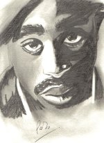
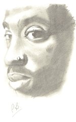
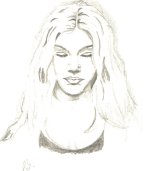
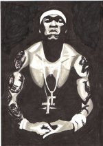
SOme Of My latest Drawings ( Non Tickle )
CheshireCatNY
2nd Level Orange Feather
- Joined
- Sep 27, 2002
- Messages
- 2,353
- Points
- 36
Wow.....just.......wow......😀 You should try doing a tickling image in that style!
Very good use of light and shadow there. But I'm going to have to disagree with Cheshire here and say that your more cartoony style would be preferable for tickling pics. Mind you I have the artistic ability of a dead camel so who am I to talk?
Low_Roads
4th Level Black Feather
- Joined
- Nov 16, 2004
- Messages
- 8,972
- Points
- 48
These are incredible, Pab! The moods are wonderfully well conveyed! I'm particularly impressed with the third and fourth: the misty, minimal approach to the girl's portrait, where gentle shadows indicate the contour; and the bold, swirling blacks of the man's portrait. They compliment each other very well; I could see them hanging side by side, as a set.
Last edited:
His Divine Shadow
Administrator
- Joined
- Dec 2, 2002
- Messages
- 18,965
- Points
- 38
*Punts to Non-Tickling Images*
You have quite the control of dark and light, pabuluz. I second Littlebighead, the third and fourth are quite well done.
You have quite the control of dark and light, pabuluz. I second Littlebighead, the third and fourth are quite well done.
nessonite1
3rd Level White Feather
- Joined
- Sep 20, 2003
- Messages
- 9,517
- Points
- 0
Impressive!!!!!! Seriously excellent work, Pab!
Spud_Mobile
TMF Expert
- Joined
- Apr 6, 2005
- Messages
- 599
- Points
- 0
Great work, Pab. I never could get the hang of drawing anything "real" and making it look good. You really do excellent charcoals. I particularly like the shadows and "blocky" feel of the fourth. Excellent drawings.
suppai1
TMF Novice
- Joined
- Jul 24, 2005
- Messages
- 53
- Points
- 0
what i think......well here goes......some advice would be to lessen the pressure on ur pencil when shading the darker areas (use the side of pencil, not tip), im sure u didnt intend for the harsh strokes to be visible (try blending or smudging them). also the first piece seems to be lacking a smooth transition from light to dark. the transition should be smooth unless u r shading areas where hard edges exist (side of nose, ears, ect). the second seems to have turned out better though it seems to need more contrast, another dark value would help. the fourth looks posterized which is prolly what you intended. a general tip would be to quit the habit of outlining when drawing from life or when going for a more realistic style, people who have grown up drawing in a more comic style seem to have a hard time letting that habit go imo which was my case. mind u this is just some friendly advice from one artist to another, i dont mean this in any way to be harsh criticism. you did do a great job in ur initial illustrations the placement and proportion is great. keep up the good work.
Last edited:
Celtic_Emperor
3rd Level White Feather
- Joined
- Nov 20, 2002
- Messages
- 9,619
- Points
- 0
Yes, what suppai has said. Good work Pab, these are really impressive. 🙂
What's New
2/18/26
Check out Clips4Sale for the webs largest number of tickling clips in one place!
Check out Clips4Sale for the webs largest number of tickling clips in one place!
Streaming Videos
Congratulations to *** brad1701 *** The winner of our weekly Trivia,
held every Sunday night at 11PM EST in our Chat Room


