-
If you would like to get your account Verified, read this thread -
The TMF is sponsored by Clips4sale - By supporting them, you're supporting us. -
>>> If you cannot get into your account email me at [email protected] <<<
Don't forget to include your username
You are using an out of date browser. It may not display this or other websites correctly.
You should upgrade or use an alternative browser.
You should upgrade or use an alternative browser.
His Divine Shadow
Administrator
- Joined
- Dec 2, 2002
- Messages
- 18,969
- Points
- 38
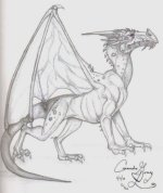
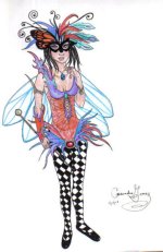
That is quite the mask the second picture features. Taking a masquerade by storm with such would be no trouble at all. I don't know if you intended it, but the dragon is rather regal looking.
'Tis quite nice to see your art again! I hadn't seen any in some time. :happy:
'Tis quite nice to see your art again! I hadn't seen any in some time. :happy:
nessonite1
3rd Level White Feather
- Joined
- Sep 20, 2003
- Messages
- 9,517
- Points
- 0
I have tried to draw dragons before and have failed quite spectacularly. Yours, on the other hand, is very well done!
Low_Roads
4th Level Black Feather
- Joined
- Nov 16, 2004
- Messages
- 8,986
- Points
- 48
The shading looks just fine to me, PunKyGurl. Those pictures are of stand-out quality, the dragon in particular. Gotta admit it: I'm a sucker for a well-drawn dragon! Good job on the musculature: the beast's physical architecture is entirely believable. Quite well posed, too. Very pleasing subtle colors in the carnivale costume. I too think the mask is striking: clever use of the butterfly motif!
Last edited:
Celtic_Emperor
3rd Level White Feather
- Joined
- Nov 20, 2002
- Messages
- 9,620
- Points
- 0
Good job, especially on the dragon. It's pretty for a sketch. 🙂
Sockstickler
1st Level Black Feather
- Joined
- Nov 28, 2005
- Messages
- 8,094
- Points
- 0
Those are very good. I also have to echo the sentiments of the others and say that I really like the dragon one as well 😀
What's New
Check out the TMF Welcome Forum for a place to say hello!
Streaming Videos
Congratulations to *** Jojo45 *** The winner of our weekly Trivia,
held every Sunday night at 11PM EST in our Chat Room


