scavenger
1st Level Red Feather
- Joined
- Jan 18, 2005
- Messages
- 1,139
- Points
- 0
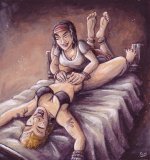
While I was painting the cover for "Weakness", I made scans of the entire process. Using these images, I wrote this demo to give some insight in my painting technique.
I also want to thank Morandilas for letting me use the finished cover.
This illustration is of course done in the traditional way: acrylics on illustration board
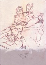
1. Raw sketch. I scanned this, enlarged it and printed it on an A4-sized paper.
2. Using carbon paper (an old type of transfer paper) I transferred the drawing onto a piece of illustration board. I then traced the drawing with a 2B (no. 0) pencil.
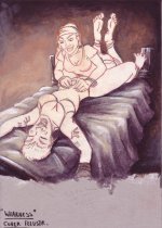
3. Blocking out the background colors. I used various mixtures of Ultramarine Blue, Burnt umber and Raw Sienna. During this phase, shadows were roughly given shape (like the folds in the bedsheet) A mix of Golden Ochre, titanium white and a bit of Raw sienna was used to paint the lightest part of the background.
4. Background highlighting. A first highlight of the background was achieved with a mixture of Golden Ochre and Titanium white, suggesting a warm yellowish light shining on the scene. A final highlight was painted on top of that using pure Titanium White.
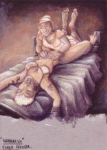
5. Main skin colour. With thinned down Raw Sienna paint, I filled out the main skin areas, adding shadows with a similarly thinned down mix of Burnt umber and Ultramarine blue.


