-
If you would like to get your account Verified, read this thread -
The TMF is sponsored by Clips4sale - By supporting them, you're supporting us. -
>>> If you cannot get into your account email me at [email protected] <<<
Don't forget to include your username
You are using an out of date browser. It may not display this or other websites correctly.
You should upgrade or use an alternative browser.
You should upgrade or use an alternative browser.
EmSeeSquared for hire!
- Thread starter FeatherJedi
- Start date
-
- Tags
- emseesquared hire
Kalamos
Level of Lime Feather
- Joined
- Jul 13, 2003
- Messages
- 13,006
- Points
- 63
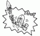
that's sort of what i was planning on doing from this discussion. it's just i've never took my previous art and made them into a graphic like u and Umojar have seemed to.
Hehehe, first time is always tougher.
Until you do it, and, as Jar said, it's first no more.
...
So, let me tell you a trick or two, so I can play the patronising role, and Jar can be the snarky guy.
...
Turning a full pic into a banner is actually EASY.
First of all, you have to spot a decent banner from somebody else.
Something with bold likes and a simple concept.
I copied mine from an existing banner - so it would match with Kuzite's ads.
Sticking with a standard size helps a lot, so you might want to check how large standard banners are, so yours will match without messing with tables and layouts.
Yeah, I know: you might be tempted to pick something large.
And by large I mean 1200*600.
Don't.
Mods will make you change it.
Users will want to change the way your face is arranged.
So. Don't.
I like borders, so consider keeping a sweet area 1 pixel thick around your picture.
You can usually crop it so the canvas is actually 2 pixels narrower and shorter.
Then you can expand it, and, presto, you have a nice empty space ready to accept a colour flood.
Choosing the right picture is of utmost importance, but if you botch the "formatting" thing, you'll discover your fave pic does not quite fit the banner size you had in mind.
Sure, you could simply build the banner around your fave illo, but that is not the point.
You are trying and learning how to draw to size. Not the other way around.
You might want to resize, crop, and rotate your image until it fits snugly the banner space.
You don't have to keep every detail: as long as it looks appealing and captivating, it's ok.
I did not put the whole pictures either. I just left the details I loved best.
Text is important too... but since you are usually adding it AFTER the main pic, you can juggle things around a bit, make it stretch around the contour and so on.
I like to place text over a dark background, sometimes a shady halo.
Jar chose to overlay text on his pics.
Anything can work, as long as people can recognise you and your banner.
Jar's banner is striking, but it would not work as an ad, because it is harder to read.
Mine had to be less flashy, so I added some extra ani for fun.
Some tasteful animation can prove captivating, especially if the text is actually telling a story of sorts.
Watch mine. You'll see.
Once the file is ready, you have to trim it down a bit.
Reduce colours, adjust compression. Just make sure anybody with a dialup will be able to watch it without having to wait ages.
Just because they won't use a 20 megs DSL, does not mean you can turn their money down.
Maybe they are between moves, or they can't get a decent DSL package where they live.
Think big, and keep it small as a backup.
I actually spend a lot of time making sure the reds won't bleed too much, and the overall contrast is right.
Since I had to change my screen, I have never been too sure about that.
So, show your banner around to friends, and let them tell you if they find it too dark, too washed out or just plain blurry.
...
I guess it is all.
I'll leave it to Jar to post one of his lovable one-liners where he call us all a bunch of dorks.
😉
...
Ok, enough reading.
Start drawing.
🙂
FeatherJedi
3rd Level Red Feather
- Joined
- Apr 30, 2001
- Messages
- 1,597
- Points
- 38
thanks a lot. i'll try to give it a shot
FeatherJedi
3rd Level Red Feather
- Joined
- Apr 30, 2001
- Messages
- 1,597
- Points
- 38
i do use photobucket. the pic over on the far left hasn't been right since tickle theater temporarily disabled animated avatars. the other messed up pic NEVER worked right when i'd uploaded to photobucket, so BigNorm created a new version of the pic for me to use, but it doesn't seem to work anymore. i still haven't heard back from him about the problem.Oh, and fix those broken pics in your avatar and sig.
Maybe most people won't give a shit, but I really find them untidy, and quite annoying.
...
Try photobucket instead.
...
😉
Kalamos
Level of Lime Feather
- Joined
- Jul 13, 2003
- Messages
- 13,006
- Points
- 63
Don't get me wrong: I don't want to sound harsh, and it's up to Umojar to make you feel miserable anyway.
But you should really show a bit more... spirit and initiative.
Maybe you could find a work-around, without relying on Norm to sort things out for you...
Just a thought.
🙂
But you should really show a bit more... spirit and initiative.
Maybe you could find a work-around, without relying on Norm to sort things out for you...
Just a thought.
🙂
FeatherJedi
3rd Level Red Feather
- Joined
- Apr 30, 2001
- Messages
- 1,597
- Points
- 38
how'm i supposed to do that when i don't know the first thing about how animated gifs work??Don't get me wrong: I don't want to sound harsh, and it's up to Umojar to make you feel miserable anyway.
But you should really show a bit more... spirit and initiative.
Maybe you could find a work-around, without relying on Norm to sort things out for you...
Just a thought.
🙂
Umojar
TMF Master
- Joined
- Jul 21, 2005
- Messages
- 832
- Points
- 0
and it's up to Umojar to make you feel miserable anyway.
WTF? O_O
What I do?!
Kalamos
Level of Lime Feather
- Joined
- Jul 13, 2003
- Messages
- 13,006
- Points
- 63
You... LEARN!how'm i supposed to do that when i don't know the first thing about how animated gifs work??
You... TEACH him!WTF? O_O
What I do?!
FeatherJedi
3rd Level Red Feather
- Joined
- Apr 30, 2001
- Messages
- 1,597
- Points
- 38
...*bops Kalamos on the head* XD
Kalamos
Level of Lime Feather
- Joined
- Jul 13, 2003
- Messages
- 13,006
- Points
- 63
Do you realise my web persona is an armoured guy, so clobbering me is fairly pointless?...*bops Kalamos on the head* XD
...
GO AND CREATE YOUR OWN AVATAR PIC!
Attachments
FeatherJedi
3rd Level Red Feather
- Joined
- Apr 30, 2001
- Messages
- 1,597
- Points
- 38
how's this? *nods at new sig banner*
FeatherJedi
3rd Level Red Feather
- Joined
- Apr 30, 2001
- Messages
- 1,597
- Points
- 38
sorry for bumping, but seriously, everyone, i'd love for some customers. the holidays are coming up, and i could REALLY use the money
What's New
2/16/26
Check out Door 44 for a great selection of tickling clips!
Check out Door 44 for a great selection of tickling clips!
Streaming Videos
Congratulations to *** brad1701 *** The winner of our weekly Trivia,
held every Sunday night at 11PM EST in our Chat Room


