• If you would like to get your account Verified, read this thread
  • The TMF is sponsored by Clips4sale - By supporting them, you're supporting us.
  • >>> If you cannot get into your account email me at [email protected] <<<
    Don't forget to include your username

The TMF is sponsored by:

Clips4Sale Banner

Ino tickles Sakura(Naruto) f/f

Kenjisan

TMF Expert
Joined
Jan 17, 2003
Messages
418
Points
16
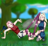
Here's another pic for you guys! I decided to do Sakura again, since my older picture with her kinda sucked, and she looks badass in her new outfit.

Anyway, for those alittle unfamiliar, Ino and Sakura are big rivals, so the picture makes a bit of sense.

Please lemme hear your comments and criticism.( I can already point out a few things 😀)

Enjoy!
 

Attachments

  • SakIno.jpg
    SakIno.jpg
    431.6 KB · Views: 4,347
Last edited:
I dont know what you're talking about when you say "I can already point things out."

This is an amazing pic. Awesome Job!
 
HeartOfMidnight said:
I dont know what you're talking about when you say "I can already point things out."

This is an amazing pic. Awesome Job!

i agree with HeartOfMidnight. I can't see any flaws, I mean sure there is a little bit of a translation from the tv onto paper but yours is one of the most realistic I've ever see.
 
You clearly do not have enough faith in your work to say there are flaws. perfect. flawless. masterpiece. all is what your picture is. How the hell are you not drawing as a profession, you are way too good dude!! :wooha:
 
Since I'm a massive Naruto fan, I must also applaud your work! 😀

There are a few details that are different from the characters in your drawing but it doesn't hinder from the overall product at all! The sketch of Sakura in particular I found to be quite bang on to the actual character.

Way to go, I am definitely looking forward to more Naruto-based drawings, if that is something you might do. (Which I hope is the case) 😀😀
 
I just replied to this on the ATF but it bears repeating. GREAT JOB!
 
Fixed the "flaw". I'm happy now. Thanks everyone for the kind comments.
 
For get umojar...this is great...nah...you both are great. I need photoshop. wait, what program do you use?
 
I use Painter 6 to ink the picture, and Photoshop 7 for coloring. I love my digitally colored pictures, but god does it take forever. >_<
 
Very nice detail in the little things, but if theres one thing that bothers me about this its the background. Its pretty blurry to the point of being distracting and strainful on the eyes if you look at it long enough.

Next time you do a background I suggest perhaps trying to blend the fore and background a bit better and not exagerating the distance of the background by using bluring.

It would be good to work in levels, where it starts off as crisp as the foreground and then slowly loses focuses the farther the objects in the back get.
 
For some reason for me, when I click the picture, about 75% of the picture is blurred by a red shading. Despite different attempts, I can't seem to fix this. Any idea's?
 
Vladislaus Dracula said:
Very nice detail in the little things, but if theres one thing that bothers me about this its the background. Its pretty blurry to the point of being distracting and strainful on the eyes if you look at it long enough.

Next time you do a background I suggest perhaps trying to blend the fore and background a bit better and not exagerating the distance of the background by using bluring.

It would be good to work in levels, where it starts off as crisp as the foreground and then slowly loses focuses the farther the objects in the back get.


Thank you for the comments. The background was put together rather quickly, perhaps about 5% of the total time I put into it, and was kinda secondary for me. The pic took a while to color, so I really didn't want to invest a great deal of time into something that wasn't that important. Dosen't sound very professional does it? I actually prefer simple backgrounds, because I want the focus to be on the action taking place. I'm sorry if it strained your eyes. 🙂
 
Fhgwagadds said:
Thank you for the comments. The background was put together rather quickly, perhaps about 5% of the total time I put into it, and was kinda secondary for me. The pic took a while to color, so I really didn't want to invest a great deal of time into something that wasn't that important. Dosen't sound very professional does it? I actually prefer simple backgrounds, because I want the focus to be on the action taking place. I'm sorry if it strained your eyes. 🙂

Well, I can't say I agree with you about backgrounds not being as important. The whole picture is important (backgrounds particularly are essential for setting mood and atmosphere, not just location), and skipping out on something intentionally just to save some time is a bad habit to get into and its a sloppy way to work. One thing can effect everything and it doesn't reflect well on the entire piece or the artist. An extra level of detail, even just one, can make the world of difference in a picture, even if you don't think it can or will. 😕

It's not about being professional, just having a good work ethic.

You could draw better backgrounds (even simple ones) and have it not take away from the action, its having the patience to give a picture that chance and opportunity to really blossom and be all that it can. Something that is a hobby, that you're doing for fun, shouldn't seem like a chore when you're doing it.

Sorry if that was too blunt or direct, but with your past work being as good as it was, I never thought you felt this way about it.

EDIT:

I noticed different things I could critique, but after having said this already, I'm not so sure thats a good idea.
 
Last edited:
The figures are beautifully done, crisp, intricately detailed and very well posed! The colors are lush and nicely balanced. Like Vlad, I wish the diffusing of the background wasn't quite so extreme. The delicately blended grass-greens and soft floral elements, however, supply a soothing pastoral gentleness that focuses attention on the participants. The effect is very pleasing indeed!
 
I intentionally wanted a shaded look for the background. I used the airbrush tool, rather than any blur filters. I actually like the look of the simple, painted look and felt that it worked best for my picture.

The thing is, believe it or not, I don't draw very often. I like drawing, but to do a full color pic, as I often want to do when I draw, is very time consuming, and often, I'll draw something that I just don't have time to color. So I try to finish them quickly, but maintain a certain quality. I honestly didn't know if I was going to do a background until I was near finished, so I decided that simple would be best since I prefer the look and didn't want to sketch and ink another background.

I can understand how the way the ink clashes with the softer look of the background may be unappealing to some, but thats the way I felt like doing it. Understand, I certainly didn't skimp on the background. To me, the picture looked done and I wouldn't have posted it otherwise.

Anyway, thanks again for the comments. Don't shy from any others. I don't take anything personally.
 
If you say so, then I believe you. I'm not here to dispute your method. I can only call it as I see it. If you say this how you wanted it, dispite the way it looks, then I accept that.

Since you are not opposed to a critique, I'd like to point out the tickler's right thigh/leg. It's quite out of proportion and way too thin. It's thin enough to hide almost completely behind the girl's foot and that shouldn't be. There is also no knee area on that leg, making it hard to tell where her thigh ends and the leg begins. And the way it bends back towards her foot looks snake-like.

This is unlike her left leg, which looks fine.

Also, the tickler's right arm is bigger than her left and it also seems to have more muscle and mass to it than the left.

So, basically, this picture has some anatomy issues.

Oddly enough, the ticklee doesn't suffer from any of these mistakes at all.

It's hard to give you advice for this picture, because you're doing things right and wrong at the same time and they're about the same subjects.
 
Last edited:
Vladislaus Dracula said:
If you say so, then I believe you. I'm not here to dispute your method. I can only call it as I see it. If you say this how you wanted it, dispite the way it looks, then I accept that.

Since you are not opposed to a critique, I'd like to point out the tickler's right thigh/leg. It's quite out of proportion and way too thin. It's thin enough to hide almost completely behind the girl's foot and that shouldn't be. There is also no knee area on that leg, making it hard to tell where her thigh ends and the leg begins. And the way it bends back towards her foot looks snake-like.

This is unlike her left leg, which looks fine.

Also, the tickler's right arm is bigger than her left and it also seems to have more muscle and mass to it than the left.

So, basically, this picture has some anatomy issues.

Oddly enough, the ticklee doesn't suffer from any of these mistakes at all.

It's hard to give you advice for this picture, because you're doing things right and wrong at the same time and they're about the same subjects.


Thanks for pointing out the leg. When I took a close look at it, I could see how it was messed up like you said, and I knew that something was wrong. I specifically remember drawing the legs better than that, so I looked at my sketch again, and it turns out that when I inked the picture, I completely missed a tiny line over Sakura's foot that better shows the progression of Ino's leg. Take a look now. Its a faint line, but I think you'll notice the improvement. Its amazing how important a tiny line can be. The knee has also been touched up.

I admit defeat for the arm, however. It does appear to be slightly thicker by a little bit. Thanks again for pointing things out!
 
I've never seen Naruto, but even I love this. 😀 Excellent stuff!!
 
I started watching it the other day, but I don't see what the hype is about so far.
 
Veeeery nicely done! I'd just say its a fantastic effort all the way 😀 . When you say there are flaws in there, they are totally outweighed by the merits of the picture, and so I didnt even notice until you pointed them out.
Anyways, fantastic effort! Thank you 😀 .
 
What's New

9/20/2024
Clips4Sale offers the most tickling clips in one place on the entire web.
Tickle Experiment
Door 44
Live Camgirls!
Live Camgirls
Streaming Videos
Pic of the Week
Pic of the Week
Congratulations to
*** brad1701 ***
The winner of our weekly Trivia, held every Sunday night at 11PM EST in our Chat Room
Back
Top