-
If you would like to get your account Verified, read this thread -
The TMF is sponsored by Clips4sale - By supporting them, you're supporting us. -
>>> If you cannot get into your account email me at [email protected] <<<
Don't forget to include your username
You are using an out of date browser. It may not display this or other websites correctly.
You should upgrade or use an alternative browser.
You should upgrade or use an alternative browser.
Knismolagniac symbol???
- Thread starter Cavum
- Start date
MasterPaladin
2nd Level Violet Feather
- Joined
- Nov 11, 2001
- Messages
- 7,418
- Points
- 0
I like the original the soft edges looks well sorry to say lame
MasterPaladin
2nd Level Violet Feather
- Joined
- Nov 11, 2001
- Messages
- 7,418
- Points
- 0
ok we need more artists
LD_Tickler
3rd Level Yellow Feather
- Joined
- Nov 23, 2005
- Messages
- 3,747
- Points
- 38
http://i69.photobucket.com/albums/i77/Eclectic-Euphoria/temp/Ksymbol4.jpg
another idea i toyed with a bit, snuck in t-m-f in the veins.
But this isn't a TMF symbol. I definitely oppose any imagery specific to this forum.
I really like http://i69.photobucket.com/albums/i77/Eclectic-Euphoria/temp/Ksymbol1.png this one, but without the light gray star and the circles. The "feathers" aren't actually feathers, but still give off a light fluttery feeling, and the points are scratchier, representing another kind of tickly feeling. Plus we could do it in two colours, representing all the dualities I mentioned in one of my earlier posts (ler/lee, love/hate, sadism/masochism).
Following that, I still think the original neuron tree is the runner up. None of those dots, or hands, or smily faces. Or even the blurred edges... not so much - I agree with Hari that the curves between the points soften the image enough.
So my vote goes to http://i69.photobucket.com/albums/i77/Eclectic-Euphoria/temp/Ksymbol2.png but without the lines in the centre that make the things look like feathers, followed by the original neuron tree.
Also, I think we should make use of AOD's thread... post contributions in one thread, and discuss in here, so that no contributions get lost in the sea of chatter.
CrystalLight
Verified
- Joined
- Jan 31, 2008
- Messages
- 15,934
- Points
- 38
I agree. This design is amazing. 🙂
MasterPaladin
2nd Level Violet Feather
- Joined
- Nov 11, 2001
- Messages
- 7,418
- Points
- 0
I like it as well
LD_Tickler
3rd Level Yellow Feather
- Joined
- Nov 23, 2005
- Messages
- 3,747
- Points
- 38
As long as the defining lines in the 'feathers' are removed. That way, they aren't necessarily feathers, but certainly look ticklingly...ish.
As much as I hate messing with simplicity, how about a design superimposing the two most popular submissions thus far? Something like this (my art software sucks mind you so the edges aren't very crisp).
Ya know, if it hasn't been suggested already this thread would be a very good addition to the TMF time capsule.
Ya know, if it hasn't been suggested already this thread would be a very good addition to the TMF time capsule.
EcEu
TMF Master
- Joined
- Apr 23, 2008
- Messages
- 633
- Points
- 0

Rorschach Blues
3rd Level Orange Feather
- Joined
- Feb 29, 2008
- Messages
- 2,700
- Points
- 0
That's a pretty cool idea, I really like that symbol, the only issue I can see is, it's a little complicated. All the best symbols are those that you can doodle in your spare time. Then again, I don't have a better solution.
LD_Tickler
3rd Level Yellow Feather
- Joined
- Nov 23, 2005
- Messages
- 3,747
- Points
- 38
THAT's what I'm talking about! Thanks Ec.
I think this ought to be the forerunner. Again, my reasons are:
1) Two shapes and two colours signifies the dualities of the tickling fetish, such as lees/lers, torture/laughter, etc.
2) The two shapes appear fluffy and sharp, respectively, which represent two tickling styles.
3) It looks nice.
LD_Tickler
3rd Level Yellow Feather
- Joined
- Nov 23, 2005
- Messages
- 3,747
- Points
- 38
As much as I hate messing with simplicity, how about a design superimposing the two most popular submissions thus far? Something like this (my art software sucks mind you so the edges aren't very crisp).
Ya know, if it hasn't been suggested already this thread would be a very good addition to the TMF time capsule.
I think if we try to compromise, we'll just wind up ruining both symbols.
Those are the two best, but I think we need to pick between them. Trying to reconcile them together runs the risk of looking clumsy and mismatched.
Ummm, this might be a stupid question / point to raise but I can see one problem with both the current forerunners - they've both got very pointed edges on them. Not a problem when drawn, a real pain if they're rendered in three dimensions for things such as pendants where those points could potentially jab in and be very uncomfortable. Just a thought mind...
LD_Tickler
3rd Level Yellow Feather
- Joined
- Nov 23, 2005
- Messages
- 3,747
- Points
- 38
Ummm, this might be a stupid question / point to raise but I can see one problem with both the current forerunners - they've both got very pointed edges on them. Not a problem when drawn, a real pain if they're rendered in three dimensions for things such as pendants where those points could potentially jab in and be very uncomfortable. Just a thought mind...
Then render a ring around the edge of it. Or etch it into a round pendant.
AngelOfDarkness
2nd Level Blue Feather
- Joined
- Nov 28, 2007
- Messages
- 5,282
- Points
- 38
Also, I think we should make use of AOD's thread... post contributions in one thread, and discuss in here, so that no contributions get lost in the sea of chatter.
Thanks, LD! Just so you don't have to search, here it is again.
I agree, post your pictures there, and then post a link to the new picture so no one misses it!
Then render a ring around the edge of it. Or etch it into a round pendant.
But then you've changed the symbol... and yes, I realise it can be personalised but adding another solid element like a ring around the outside surely adds something that should be part of the overal symbolic design? Maybe I'm missing something but surely a symbol for the community needs to be ONE symbol, not countless variations on a theme? The only reason you see so many subtle variations on the BDSM symbol, for example, is the original version was created as a way of making money via copyright (and is an ongoing extortion racket to this day) and so some slightly different versions were created to get around this particular problem.
Not saying for one moment I'm against the idea, I just think that a single symbol to represent the tickling fetish should be just that... a single design. My personal opinion only, not looking to argue just puting forward another viewpoint.
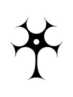
Just another combination. I like the symmetry of this one as the "feathers" form a star and can easily be explained away. Also there's 5 feathers for 5 fingers if you're looking for more symbolism. I'm still a fan of the original neuron tree the most though.
EcEu
TMF Master
- Joined
- Apr 23, 2008
- Messages
- 633
- Points
- 0

http://i69.photobucket.com/albums/i77/Eclectic-Euphoria/temp/Ksymbol_Hari_redone.png
I could have sworn i submitted this a second ago.
in case i didn't, here's Hari's design again, redone in illustrator, because i got sick of how rough it looked
CrystalLight
Verified
- Joined
- Jan 31, 2008
- Messages
- 15,934
- Points
- 38
Just another combination. I like the symmetry of this one as the "feathers" form a star and can easily be explained away. Also there's 5 feathers for 5 fingers if you're looking for more symbolism. I'm still a fan of the original neuron tree the most though.
That's a unique angle as well. 🙂
LD_Tickler
3rd Level Yellow Feather
- Joined
- Nov 23, 2005
- Messages
- 3,747
- Points
- 38
But then you've changed the symbol... and yes, I realise it can be personalised but adding another solid element like a ring around the outside surely adds something that should be part of the overal symbolic design? Maybe I'm missing something but surely a symbol for the community needs to be ONE symbol, not countless variations on a theme? The only reason you see so many subtle variations on the BDSM symbol, for example, is the original version was created as a way of making money via copyright (and is an ongoing extortion racket to this day) and so some slightly different versions were created to get around this particular problem.
Not saying for one moment I'm against the idea, I just think that a single symbol to represent the tickling fetish should be just that... a single design. My personal opinion only, not looking to argue just puting forward another viewpoint.
I agree with you, but I don't think putting the symbol in a ring so it can hang on your necklace alters it.
Skipadeedoodah
Level of Grape Feather
- Joined
- Dec 24, 2002
- Messages
- 16,612
- Points
- 38
I think if we try to compromise, we'll just wind up ruining both symbols.
Those are the two best, but I think we need to pick between them. Trying to reconcile them together runs the risk of looking clumsy and mismatched.
I agree...
Just another combination. I like the symmetry of this one as the "feathers" form a star and can easily be explained away. Also there's 5 feathers for 5 fingers if you're looking for more symbolism. I'm still a fan of the original neuron tree the most though.
...and yet I kind of enjoy this
Ah, im glad you did this, would ya mind puttin the hole in it 😉
http://i69.photobucket.com/albums/i77/Eclectic-Euphoria/temp/Ksymbol_Hari_redone.png
I could have sworn i submitted this a second ago.
in case i didn't, here's Hari's design again, redone in illustrator, because i got sick of how rough it looked
Mine was pretty ruff 😛
I did it on microsoft paint 😉
This is good!!! definatly another front runner, Thats two designs now that at least *I* can see being valid for the final choice.
As a side note ot others... pleeeease stop playing with the Neuron tree, its had more variations than weve had new ideas, I really dont think it can be improved, think of something new 😛
I agree with you, but I don't think putting the symbol in a ring so it can hang on your necklace alters it.
I second this, under the logic that printing it on a t-shirt doesnt alter it either, its just more practical than making a Neuron tree shaped T-shirt 😛
MasterPaladin
2nd Level Violet Feather
- Joined
- Nov 11, 2001
- Messages
- 7,418
- Points
- 0

What's New
Check out Clips4Sale for the webs largest one-stop fetish clip store!
Door 44
Live Camgirls!

Streaming Videos

Pic of the Week
Congratulations to *** brad11701 *** The winner of our weekly Trivia,
held every Sunday night at 11PM EST in our Chat Room