LonelyKimiko
3rd Level Indigo Feather
- Joined
- Oct 22, 2005
- Messages
- 6,668
- Points
- 0
Well, I'm hoping 😀 .

Don't blame yourself, man.Littlebighead said:Beelzebub! I could have sworn I had checked before I wrote!
Taunt, of course.lonelykimiko said:Yup, we can see where you invested all those skill points 😉 .
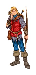
I should mention the first one is an actual char of mine from NWN.lonelykimiko said:Wow 😀 . I really like them both, especially the first one ^_^ .
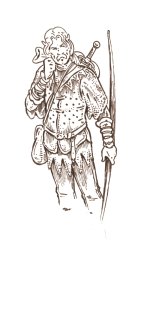
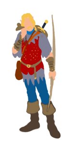
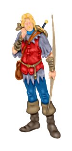
Thanks for your words.Littlebighead said:Your martial themes always seem to inspire especially fine, exact detail (though delivered with an easy verisimilitude... almost as though, instead of studying diligently, as must have been done, you'd befriended two Medieval bowmen and were able to sketch them at your leisure).
Kalamos said:Well... yes... it was all about dying!
...
It's quite long-winded, and I'm long over-due my maintenance shift, but I'll try and give you the abridged version.
So, it all started with a weird story, a kind of fan fic featuring, among the others, Camel, Georgiatklr and yours truly.
In a fell swing, Georgiatklr had the both us die, and reincarnate as *moles*.
Not the subterranean variety, mind you, rather, the spot-on-the-skin kind, on Camel's feet.
-> http://www.tickletheater.com/showthread.php?t=7201&highlight=kalamos+saudelli
Apparently, in Georgia's story, Saudelli's goons discovered a slew of counterfeited pics, and dealt swift mob-style justice on my flesh and blood self, as told in this - rather blurry - pic.
-> http://www.tickletheater.com/showthread.php?t=7412&highlight=murder+drew
For a while I "role-played" dead, posting a skull as my avatar and behaving as if I were, for most accounts, deceased.
A few users actually fell for it... others never realised or read the whole story, so they thought I simply had a fancy for undead and stuff.
My undead persona developed into a yellow skeleton in a purple robe.
A lot of jokes ensued, and resulted in more wacky "art" I'll be posting by 15k.
After a while, thanks to the lack of taste of a few guys, the corpse thing grew, so to speak, stale.
I somehow got resurrected, or rather, passed to my next stage of undeath: an incorporeal revenant in a gothic suit of armour.
The passage was quite slow. Slower than the prev passage would indicate.
At first I simply put the fancy sallet you might be familiar with.
People got to know me after it, and to some I was the guy with the helmet.
A few jokes later, some nice, a few nasty, I got to develop a full body for my hollow helmet.
My web persona shifted to a full hollow armour; I started drawing myself as the hobbly armoured guy you're well familiar with.
Except for the odd adjustment or lapse in memory, the Kal-armour char is well defined and fixed, and it suits - erm... - me well.
The most notable feature is still the rounded over-sized helmet, covering my features save for the eyes, patterned as pinpoints of light, sometimes conveying my feelings through changes in shape and hue.
I *did* appear out of my armour in a few instances, but nobody realised it was actually me.
And I did draw myself full armoured save for the helm, with my real world features.
Again, few ever took notice since the thread the pic was being hosted in, got deleted.
...
The pics you got to see date to my bony period, when my corporeal undead persona was quite prone to crumbling to pieces, and resident ladies, for some reason, were quite keen on playing with my scattered remains.
Of course, as you can see, they usually got more than they had at first bargained for.
...
So much for the abridging... eh? 😉
Good eye of you. 😉Umojar said:The shading and the line quality on the boots is different from the rest of the body. It's only distracting to me because it's inconsistent with the overall style of the work.
Well, no 17k, so let there be twice for 18k.Littlebighead said:Horrors! Fresh graphics to view (and you said there'd be no 18K update!)
Just a little thing from Nerrad's thread.Which leaves the two-part comic cat-fight! This appears to be brand-spanking new.
Just catprints, not stress marks, though.I didn't know metal armor could assume those manga-style irritation marks, by the way...
Thanks. 😀Umojar said:There's so many different types of faces and they're even drawn in different styles. That shows true talent. I'm looking forward to the next set.
Kalamos said:Hope you liked them.
Ness probably did.
Nerrad dunno.
Umojar didn't get to see them.
And... no, I can't track people's surfing habits, can I?
Dunno. Been reposting older stuff.nerrad said:Which ones are we talking about here? I didn't think I'd missed anything.